Is Civilization VII's UI Really That Bad? A Critical Assessment

Civilization VII's Deluxe Edition launched recently, and online discussions are already buzzing about its user interface (UI) and other shortcomings. But is the UI truly as flawed as some claim? Let's analyze the game's UI elements and determine if the criticism is justified.
← Return to Sid Meier's Civilization VII main article
Deconstructing the UI: Meeting 4X Standards
While the internet quickly formed opinions, a more objective evaluation is needed. We'll break down the UI piece by piece, comparing it to the characteristics of a well-designed 4X game interface.
Essential Elements of a Strong 4X UI
Defining an objectively "good" 4X UI is subjective. However, common principles of effective UI design exist, which we'll use as benchmarks.
Information Hierarchy: Prioritizing Accessibility
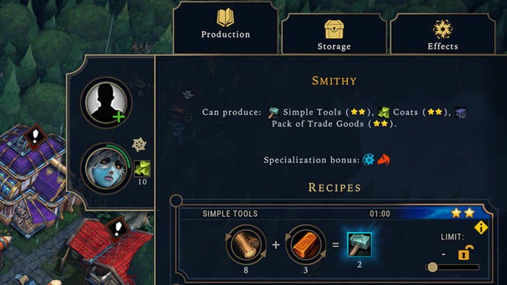
A good 4X UI prioritizes essential information. Frequently used resources and mechanics should be readily visible, while less critical elements remain easily accessible. The UI shouldn't overwhelm the player with unnecessary details. Against the Storm's building info menus serve as a strong example of this.
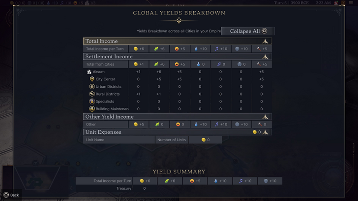
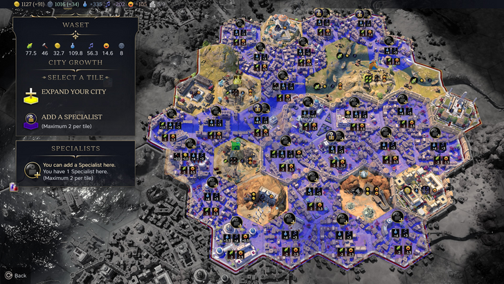
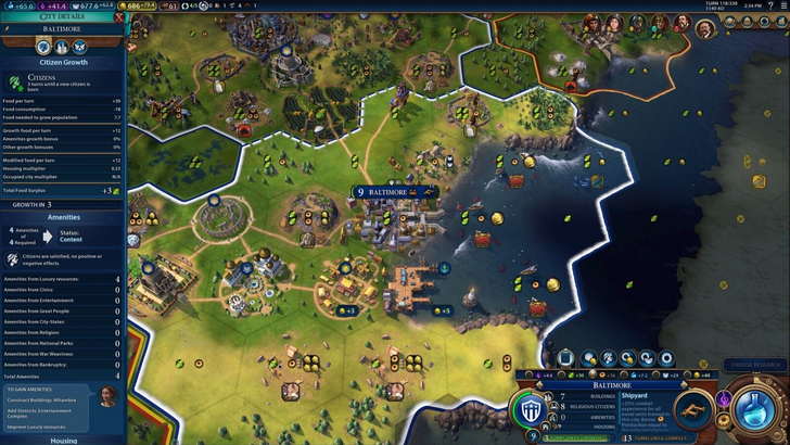
Civilization VII's resource summary menu displays resource allocation, separating income, yields, and expenses. While structured well and collapsible, it lacks granular detail. It shows resource totals from Rural Districts but doesn't specify individual districts or hexes. Expense breakdowns are also limited. The UI functions adequately but could benefit from increased specificity.
Visual Indicators: Communicating at a Glance
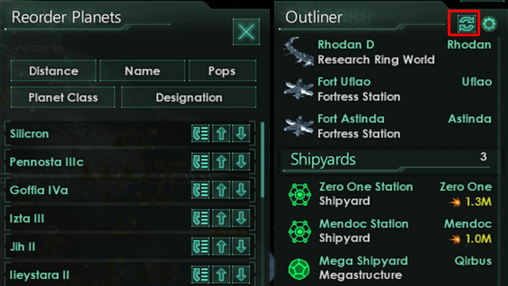
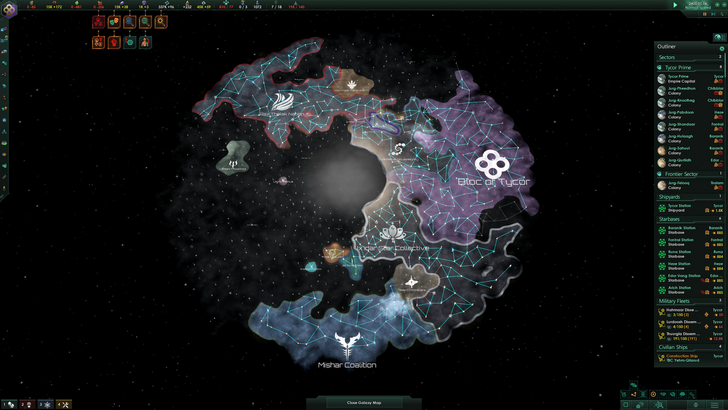
Effective visual indicators (icons, colors, overlays) convey information quickly. Stellaris's Outliner exemplifies this, clearly showing ship status and colony needs.
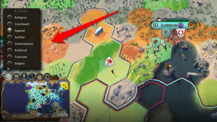
Civilization VII utilizes iconography and numerical data for resources. Tile yield overlays, settlement overlays, and settlement expansion screens are effective. However, the absence of certain lenses present in Civ VI (e.g., appeal, tourism, loyalty) and customizable map pins has been criticized. While not disastrous, improvements are possible.
Search, Filtering, and Sorting: Managing Information Overload
As complexity increases, search, filtering, and sorting become crucial. Civ VI's powerful search function is a prime example.
Civilization VII lacks this crucial search function, a significant drawback for many players. This omission hinders usability, especially considering the game's scale. The absence of a robust search is a major usability issue.
Design and Visual Consistency: The Overall Aesthetic
UI design significantly impacts player experience. Civ VI's dynamic, cohesive style enhances the overall aesthetic.
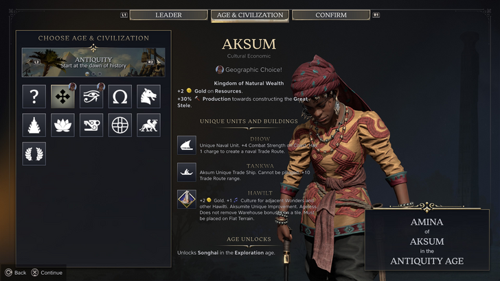
Civilization VII adopts a minimalist, sleek design. The color palette (black and gold) is sophisticated but less vibrant than Civ VI. The more subtle thematic direction has resulted in mixed reactions, highlighting the subjective nature of visual design.
The Verdict: Not as Bad as Advertised
While not perfect, Civilization VII's UI isn't as terrible as some claim. The missing search function is a significant flaw, but not game-breaking. Compared to other issues, the UI's shortcomings are relatively minor. While it falls short of some competitors, it possesses strengths. Future updates and player feedback could significantly improve it.
← Return to Sid Meier's Civilization VII main article
Sid Meier's Civilization VII Similar Games